Data Visualization of Prop 6
March 2019


Summary
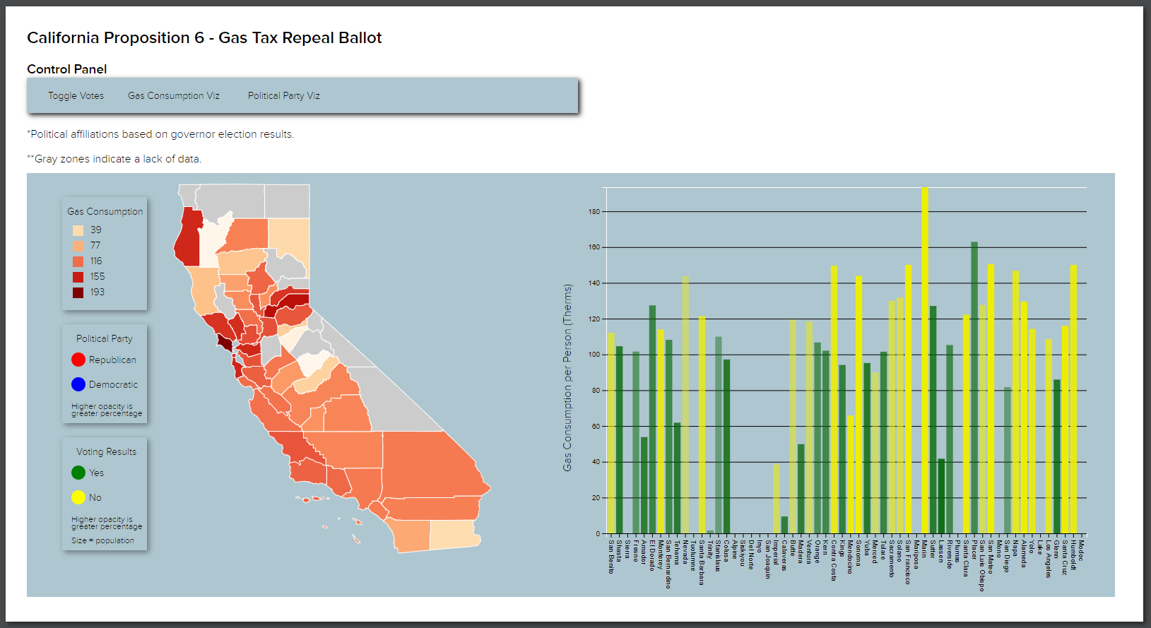
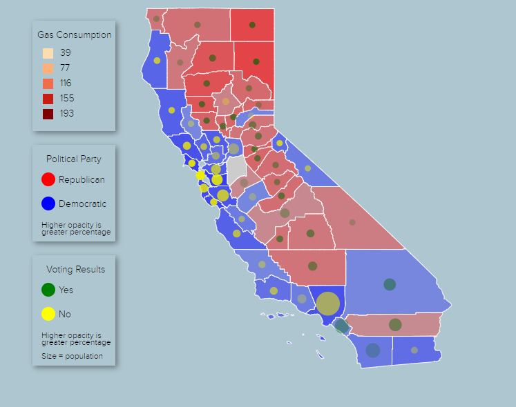
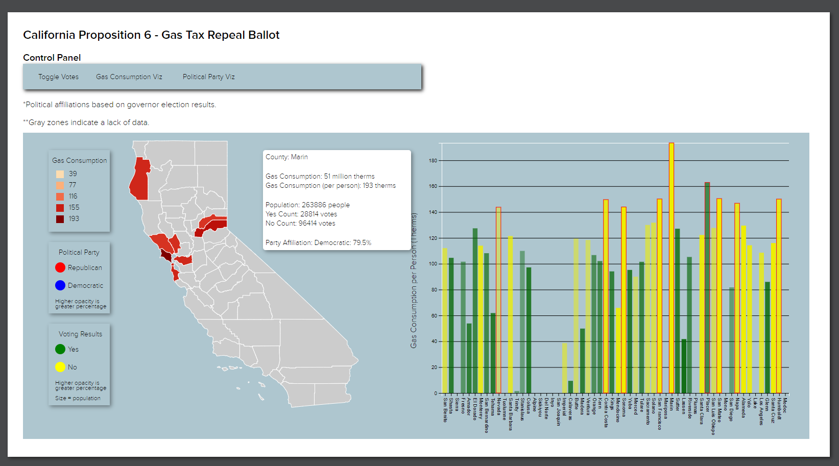
In this project, I use the D3js library to analyze the results of the midterm elections of 2018, something that, while seemingly insignificant, may present itself as an important topic given the contentious and volatile nature of America’s political state today. By creating an interactive, data-driven geographic visualization of the voting results, I concluded that voters voted for the repeal of the gas tax based not on individual gas consumption, i.e., logic, but instead based mainly on political party and ideology. The project was a fun introduction to D3 and data viz in general. If I could go back and change a part of this project, I would reorganize the code into different modules, possibly use VueJS or another framework to separate the charts into different components, and move the data into a database. This would increase the possible scope of the project, as well as promote reuse of the code that I wrote to analyze different election results, using the same general codebase.
Takeaways
- D3js and Google Maps API - I learned how to use the D3js library along with the Google Maps API to implement a geographic data visualization of an election. Using these, I can now make interactive data driven visualizations.
- Modular and Reusable Code - As I was still new to coding when I made this project, I did not organize the code very well, and as a result, modifications even during the creation of the project were difficult, let alone future extensions. The project made me realize the importance of code modularity and architecture, and for future projects I made it a priority to do so, to avoid the problems that this project had.
